By Daniel Kull
It is a truth universally acknowledged — military leaders are expected to deliver a coherent PowerPoint brief. You will be judged on your ability to communicate via PowerPoint. Do it well, and the people who write your evaluation will stroke their chins and nod approvingly. But do it poorly, and they will cluck their tongues and shake their heads. “A pity,” they’ll say, “that an otherwise excellent leader lacks the skill to communicate effectively. But alas! One must PowerPoint well to be promoted.”
There exists no overarching doctrine on how best to construct a PowerPoint slide. What constitutes right or wrong is often a subjective assessment, judged separately by both the briefer and the audience, shaped by their previous experiences in receiving or delivering effective or ineffective PowerPoint briefs.
PowerPoint is a briefer’s weapon system. In the hands of a clumsy briefer, it can cause disorientation and confusion. But in the hands of a skilled briefer, it can be an effective tool for presenting information. If its utility lies in the prowess of the briefer, then I respectfully submit three principles to guide the briefer.
1. Know your desired effect when building the slide. The audience is receiving and processing data through a lens that you cannot discern. Therefore, you must know what your desired effect is – i.e., what the message received should be – and work backward from there to build a slide that delivers that effect with minimum risk of it being distorted in transit by the audience’s lenses. After all, a message sent does not mean a message received. Anyone who has been married knows this maxim: you say one thing, your spouse hears something else, and even though the words spoken equal the words heard, the message is distorted in transit and before you know it, you’re sleeping on the couch.
2. Deliver visual data instead of words. PowerPoint is effective for delivering charts, tables, graphs, and maps—i.e. data difficult to express through spoken word. It is generally not effective for delivering text, where your spoken word is a more effective tool for delivering the message. When you must deliver verbiage by PowerPoint, bulleted lists are a lesser evil than blocks of text. PowerPoint karaoke, where you read the text of the slide to the audience (always at a pace agonizingly slower than the audience could read it themselves) is an insult to the audience.
3. The aesthetic beauty of a slide is proportional to the clarity of data. Fight the urge to cram data into every available crevice and decorate the slide with colors and graphics. Be deliberate with what you place on the slide, and likewise, be deliberate about what you leave blank. White space is not a bad thing – it focuses the audience’s attention on the data displayed. Unnecessary decorations clutter the slide and obscure the data. Your goal is to achieve intuitive data visualization. You want your audience to absorb your message with little effort. Psychologist Daniel Kahneman, in his 2011 book Thinking, Fast and Slow, described how humans think on two levels: System 1 is the intuitive, instinctive, emotional manner of thinking; System 2 is the logical, deliberate manner of thinking.For example, solving the math problem 2×2 uses System 1, as you instinctively know the answer from having memorized multiplication tables as a child. Solving the math problem 23×72 uses System 2, as you must deliberately work through a mental multiplication process to solve the problem. When conveying information to your audience, you should strive to activate your audience’s System 1. If you see your audience furrow their brows and frown as they struggle to comprehend your message, there is a risk that the message sent will not be the message received. Every element of the slide should be deliberate in bringing about your desired effect.
With these three guiding principles, I present an example of flawless data visualization Consider John Snow’s map of the London cholera outbreak of 1854:

In 1854, physician John Snow proposed that an ongoing cholera epidemic was caused by sewage that had seeped into the water supply. To prove his point, Dr. Snow presented this simple dot distribution map. Look closely – circles are water pumps and stacks of squares are cholera cases. His map shows that nearly all cases shared a single pump as the closest water source. Local authorities disabled the pump as the epidemic subsided. Note the spartan quality of this image – devoid of unnecessary colors or other distractions, it conveyed a direct message to the audience. Clarity of data is its own beauty.
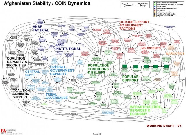
How can common military briefings achieve this Platonic ideal? Consider next the below quad chart, a sample safety officer briefing template which is publicly available from the U.S. Army Combat Readiness Center.

Quad charts are intrinsically troublesome, as they demand that the audience split its attention among four discrete cells, all competing for prominence. Yet there are a few things that this chart does well. First, note the color coding in the bottom two quads – green is good, red is bad, and amber is cautionary. These colors appeal to the audience’s System 1 instincts for discerning the raw numbers. Next, note the juxtaposition of text sizes in the bottom two quads – the audience’s eye is drawn to the larger text, which represents important data. Smaller text represents captions and chart headings and should not be competing for the audience’s attention. Lastly, note the use of the graph in the upper left quad – PowerPoint is more effective than the spoken word in expressing graphics such as tables, charts, maps, etc.
What could this quad chart do better? Certainly, there is far too much text in the upper right quad – the leader who delivers this brief would want to delete the stage directions therein and turn it into a graphic that supports the spoken part of the brief. Also consider the use of color coding in the top left quad – if red triggers the audience’s intuition that the datum is bad news, why use red as the color for Class C mishaps? A more intuitive use of color coding in this graph may have been bright red for the worst kind of mishap, with progressively softer shades of orange and amber for lesser mishaps.
PowerPoint is a briefing tool; it is not the briefer. A skillful briefer delivers a brief such that the audience receives the message from the briefer’s lips and the PowerPoint slide serves to illustrate or buttress the briefer’s spoken word. That’s not to say that a PowerPoint slide that tells the entire brief is intrinsically bad – but if you find that the PowerPoint slide tells the entire story and your presence is utterly unnecessary, then you are committing one of the worst organizational sins: a meeting that could have been an email. Just send the slide by email and give everyone in the audience their time back.
I share the frustration that so many military leaders have about our organizational overreliance on PowerPoint. There may yet be a day when we finally rid ourselves of this troublesome application and purge it from our culture. If we do, it will be by the grace of a senior leader who was successful enough in delivering PowerPoint briefs to earn the requisite promotions to make this change. Until then, using the three principles I’ve listed above, leaders can craft informative, compelling, and aesthetically pleasing PowerPoint briefs. More importantly, they can coherently convey data to impart critical information and equip decision-makers with the knowledge necessary to win in battle.
Lieutenant Colonel Daniel Kull, U.S. Army, has been constructing PowerPoint briefs of dubious quality for over 21 years, including PowerPoint briefs delivered over the course of three discrete combat deployments to Iraq. He currently serves as the Deputy G-6 of V Corps.